New logo reinforces EIB role as key EU player
Simple, sober, clear. Sabine Tissot needed to embody several qualities at once in her design for a new logo for the European Investment Bank.
“A logo must be memorable and recognizable,” says Tissot, who leads the EIB’s graphic design team. She spent over a year working on dozens of different proposals to develop a new visual identity that reflects the role of the European Investment Bank Group.
This is the European Investment Bank’s first entirely new logo since 1999. In the past two decades, the Bank has expanded its lending massively and become a major player in crucial areas of the global economy, such as climate action. The Bank has been at the heart of the EU response to the financial crises, the COVID-19 pandemic and the Russian invasion of Ukraine.
EIB graphic design team
“We wanted people to recognize at first glance that we are part of the European Union family,” Tissot says. “And we wanted a design that conveys our group identity: European Investment Bank, European Investment Fund, and EIB Global.”
Inspired by architecture and history
The final design, which includes the EU flag and the image of the Bank’s headquarters in Luxembourg, was unveiled on 2 February 2023. The new logo aligns the identity of the EIB with several EU institutions that have a logo inspired by their buildings in combination with the EU flag.
The new EIB design depicts the lines of the wave-shaped “East Building” on the Luxembourg campus, designed by Ingenhoven Overdiek Architekten and inaugurated in 2008. The straight horizontal lines of the logo evoke the horizon and the land, or stability, balance and trust. The rising grey line represents progress and dynamism.
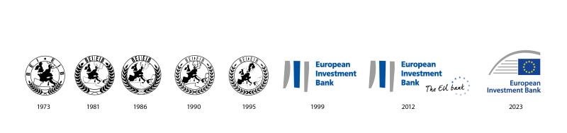
The five EIB logos used from 1963 to 1998 were similar, inspired by the United Nations’ circular emblem, with the EU map in the centre. The logo used from 1999 to January 2023 was a big departure in design. It was meant to represent stability, using a design inspired by a Chinese character that means ‘river’.
Stability and progress
“We went from a logo that associated us with Europe, with other countries, to a very abstract but still meaningful one for many of us,” Tissot says. “Now our logo is emphasising Europe and its role in the world. We have come full circle in a way.”
When asked to summarize the new design in a few words, Tissot responds, “Europe, let’s look to the future.”